graphic context就象Control最頂層的畫板,它可以使你向GUI components加入客制化的圖形,圖片,及不同字體的文本。同樣也提供事件處理
graphic context是在GC類中的,GC對象是附著于現存的Controls。
要創建一個graphically oriented的應用程序,首先要創建graphic context,并將其與一個component相關聯,這兩步都可通過GC的constructor來實現。共有2個構造函數,見下:
1. GC(Drawable)--Creates a GC and configures it for the Drawable object
2. GC(Drawable, int)--Creates and configures a GC and sets the text-display style,第二個參數可以是RIGHT_TO_LEFT或LEFT_TO_RIGHT(默認值);
第一個參數需要實現Drawable接口的對象, 此接口包含了與graphic context.內部相聯系的方法。SWT提供了三個實現Drawable接口的類:Image, Device,?和 Control.
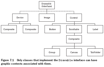
Control子類雖然都能包含圖形,但只有一個類是特別適合GC對象的:Canvas。它不僅提供了一個Composite的containment property,還可以用一系列的風格來定義圖形在此區域內如何顯示
示例:
package com.swtjface.Ch7;
import org.eclipse.swt.SWT;
import org.eclipse.swt.graphics.*;
import org.eclipse.swt.widgets.*;
public class DrawExample
{
public static void main (String [] args)
{
Display display = new Display();
Shell shell = new Shell(display);
shell.setText("Drawing Example");
Canvas canvas = new Canvas(shell, SWT.NONE);
canvas.setSize(150, 150);
canvas.setLocation(20, 20);//在shell中創建canvas
shell.open ();
shell.setSize(200,220);
GC gc = new GC(canvas);//在canvas中創建graphic context
gc.drawRectangle(10, 10, 40, 45);
gc.drawOval(65, 10, 30, 35);
gc.drawLine(130, 10, 90, 80);
gc.drawPolygon(new int[] {20, 70, 45, 90, 70, 70});
gc.drawPolyline(new int[] {10,120,70,100,100,130,130,75});
gc.dispose();//釋放Color對象
while (!shell.isDisposed())
{
?if (!display.readAndDispatch())
?display.sleep();
?}
?display.dispose();
?}
?}
有兩點需要注意:1.在調用shell.open()之前構建Canvas對象,然后在調用shell.open()之后創建和使用GC對象
???????????????????? 2.在使用完之后一定要立即釋放GC object
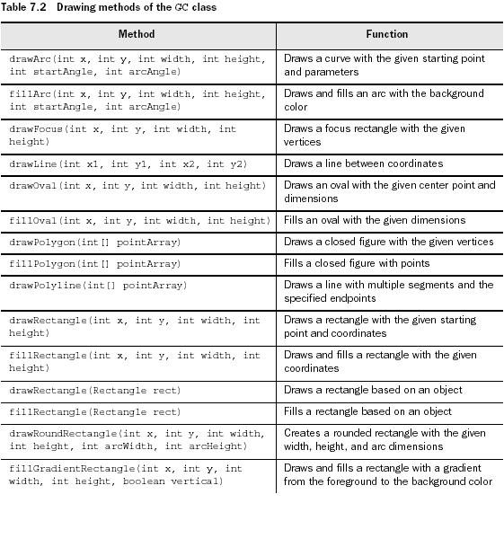
如上例所示GC提供了一系列在Drawable對象上畫圖形的方法,如下:
但是上例中有個問題:當shell被變灰過或者最小化過之后,圖形就會被擦去。所以我們需要解決的事,無論window怎么變化,圖形都保持可見。因此SWT在一個Drawable對象被刷新后讓你自行控制。這個更新的過程就被稱為painting。
Painting and PaintEvents
當一個GC方法在一個Drawabel對象上畫出一個圖案,它僅執行這個painting過程一次。如果用戶改變對象尺寸或是用另一個窗口去覆蓋它,則圖形會被消除。因此,應用程序能否在外界事件影響下維持其外觀這一點相當重要。
這些外部事件被稱為PaintEvents,接收它們的程序接口是PaintListener。一個Control在任何時候當其外觀被應用程序或是外界活動改變都會觸發一個PaintEvent。這些類對于事件和監聽器的使用方式都和我們在第四章內提到的類似。由于PaintListener只有一個事件處理方法,所以不需要使用adapter類
Canvas canvas = new Canvas(shell, SWT.NONE);
canvas.setSize(150, 150);
canvas.setLocation(20, 20);
canvas.addPaintListener(new PaintListener()
{
public void paintControl(PaintEvent pe)
{
GC gc = pe.gc;//每一個PaintEvent對象都包含有其自己的GC
gc.drawPolyline(new int[] {10,120,70,100,100,130,130,75});
}
});
shell.open();
每一個PaintEvent對象都包含有其自己的GC,主要有2個原因:1.因為這個GC instance是由事件產生的,所以PaintEvent會負責釋放他。2.應用程序可以在shell open之前創建GC,這樣可以使圖形在一個獨立的類中被創建。
SWT在PaintListener接口內優化painting過程,SWT的開發者強烈建議Control的painting僅對PaintEvent作出反應。如果一個應用程序因為其他原因必須更新其圖形,則他們推薦使用control的redraw()方法,這會在隊列中加入一個paint請求。之后,你可以調用update()方法來處理所有的綁定于該對象的paint請求。
需要牢記的是,雖然對于Control對象推薦在一個PaintListener內painting,但是由于Device和Image對象并不能在該接口內使用。如果你需要在一個image或device內生成圖形,你必須單獨地生成一個GC對象并在使用結束后將其銷毀。
posted @
2006-04-14 11:26 JOO 閱讀(549) |
評論 (0) |
編輯 收藏
要客制化layout,需要繼承抽象類Layout,需要寫2個方法——computeSize() 和layout().
computeSize()
protected Point computeSize(Composite composite,
int wHint, int hHint,
boolean flushCache)
{
Point maxDimensions =
calculateMaxDimensions(composite.getChildren());
int stepsPerHemisphere =
stepsPerHemisphere(composite.getChildren().length);
int maxWidth = maxDimensions.x;
int maxHeight = maxDimensions.y;
int dimensionMultiplier = (stepsPerHemisphere + 1);
int controlWidth = maxWidth * dimensionMultiplier;
int controlHeight = maxHeight * dimensionMultiplier;
int diameter = Math.max(controlWidth, controlHeight);
Point preferredSize = new Point(diameter,
diameter);
... // code to handle case when our calculations
// are too large
return preferredSize;
}
參數:
1.composite--The object we’re going to populate. At the time this method is called, it has children, but neither the composite nor the children have been sized or positioned on the screen.
2.wHint and hHint--layout所需的最大長寬。若帶有參數SWT.DEFAULT,表示此layout可以隨意使用use whatever sizes it decides it needs.
3.flushCache--作為flag,to tell the layout whether it’s safe to use any cached values that it may be maintaining.
computeSize()的目的主要在于計算我們要layout的composite有多大
layout()
……
posted @
2006-04-12 17:19 JOO 閱讀(349) |
評論 (0) |
編輯 收藏
與之前所述的layout不同,form layout不是基于行和列的,它是基于與其他control之間的相對位置的。
FormLayout十分簡單,你只要:1.設定頁邊距(高,寬)屬性。 2.設定spacing屬性,即所有control間的距離(in pixels)
同樣可以使用FormData來配置單個的control。
FormData
如果一個control沒有一個FormData實例來描述它的話,就會默認放在composite的右上角
width和height屬性指定了control的尺寸,in pixels.
top, bottom, right, 和left屬性,每一個都有一個FormAttachment實例,這些attachments描述了control與其他control之間的關系。
FormAttachment
有2個使用途徑:
1.通過使用percentage of the parent composite.
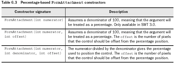
2.通過設定一個control和另一個control之間的相對位置?
《圖》
package com.swtjface.Ch6;
import org.eclipse.swt.*;
import org.eclipse.swt.widgets.*;
import org.eclipse.swt.layout.*;
public class Ch6FormLayoutComposite extends Composite {
public Ch6FormLayoutComposite(Composite parent) {
super(parent, SWT.NONE);
FormLayout layout = new FormLayout();
setLayout(layout);
Text t = new Text(this, SWT.MULTI);
FormData data = new FormData();
data.top = new FormAttachment(0, 0);
data.left = new FormAttachment(0, 0);
data.right = new FormAttachment(100);
data.bottom = new FormAttachment(75);//確定text的位置,因為左上角是坐標原點,所以right的百分數為100。
t.setLayoutData(data);
Button ok = new Button(this, SWT.NONE);
ok.setText("Ok");
Button cancel = new Button(this, SWT.NONE);
cancel.setText("Cancel");
data = new FormData();
data.top = new FormAttachment(t);
data.right = new FormAttachment(cancel);//ok按鈕在text下面,cancel左邊
ok.setLayoutData(data);
data = new FormData();
data.top = new FormAttachment(t);
data.right = new FormAttachment(100);//cancel按鈕在text下面,在最右邊
cancel.setLayoutData(data);
}
}
posted @
2006-04-12 12:22 JOO 閱讀(385) |
評論 (0) |
編輯 收藏
最常用的一種layout.以row layout為基礎。
package com.swtjface.Ch6;
import org.eclipse.swt.*;
import org.eclipse.swt.widgets.*;
import org.eclipse.swt.layout.*;
public class Ch6GridLayoutComposite extends Composite {
public Ch6GridLayoutComposite(Composite parent) {
super(parent, SWT.NONE);
GridLayout layout = new GridLayout(4,false);//每一行有4個control,后一個參數是a
boolean to indicate whether the columns should take up an even amount of
space. By passing false, you tell the layout to only use the minimum amount of
space needed for each column.
setLayout(layout);
for (int i = 0; i < 16; ++i) {
Button button = new Button(this, SWT.NONE);
button.setText("Cell " + i);
}
}
}
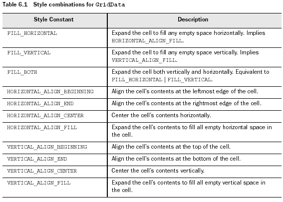
Using GridData styles
十分類似于RowData對象。可通過其構造函數來設定STYLE,這些STYLE可分為3類:FILL, HORIZONTAL_ALIGN, and VERTICAL_ALIGN.
1.FILL:此cell是否fill所有的availabe的空間。可用的值還包括FILL_HORIZONTAL(水平擴張),FILL_VERTICAL(垂直擴張),FILL_BOTH。
2.ALIGN,用來指定control在cell中的什么位置。值包括BEGINNING, END, CENTER和FILL。
具體參見下表
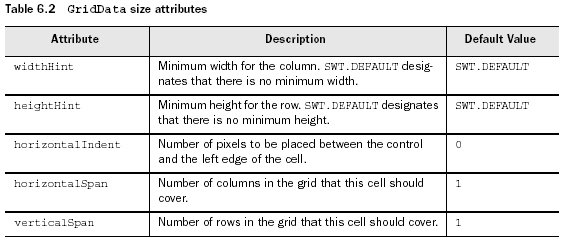
Using GridData size attributes
與RowData不同,GridData還有很多的public屬性。其中有些是布爾值類型的,一般會根據所設置的不同styles而自動管理,所以無需對其直接操作。還有一些是integer值,用來確定單個cells的大小。具體件下表:
posted @
2006-04-11 16:16 JOO 閱讀(345) |
評論 (0) |
編輯 收藏
package com.swtjface.Ch6;
import org.eclipse.swt.*;
import org.eclipse.swt.widgets.*;
import org.eclipse.swt.layout.*;
public class Ch6RowLayoutComposite extends Composite {
public Ch6RowLayoutComposite(Composite parent) {
super(parent, SWT.NONE);
RowLayout layout = new RowLayout(SWT.HORIZONTAL);
setLayout(layout);
for (int i = 0; i < 16; ++i) {
Button button = new Button(this, SWT.NONE);
button.setText("Sample Text");
}
}
}
wrap——默認為true,若設為false,所有的controls都在同一行。
pack——默認為true.使所有的child controls都大小一樣。
justify——默認為false. 若為true,每一行的control都會以間隔相同的方式排列。
RowData
可以通過setLayoutData()來設定每個control的大小,如:button.setLayoutData(new RowData(200 + 5 * i, 20 + i));
posted @
2006-04-11 15:58 JOO 閱讀(305) |
評論 (0) |
編輯 收藏
默認為從左到右排放的,根據每個control實際所需的大小來分配空間,此composite中多于出來的空間,再平攤到每個control上。隨著composite的大小調整,control的大小也會跟著調整。
package com.swtjface.Ch6;
import org.eclipse.swt.*;
import org.eclipse.swt.widgets.*;
import org.eclipse.swt.layout.*;
public class Ch6FillLayoutComposite extends Composite {
public Ch6FillLayoutComposite(Composite parent) {
super(parent, SWT.NONE);
FillLayout layout = new FillLayout( SWT.VERTICAL); //默認是SWT.HORIZONTAL
setLayout(layout);//為此Composite設定一個layout.如果漏了此語句,會顯示不出child control。
for (int i = 0; i < 8; ++i) {
Button button = new Button(this, SWT.NONE);
button.setText("Sample Text");
}
}
}
posted @
2006-04-11 15:23 JOO 閱讀(274) |
評論 (0) |
編輯 收藏
同ProgressIndicator一樣,它支持工作的虛擬單位,you need only initialize the ProgressIndicator with the total amount of work you expect to do and notify it as work is completed:
ProgressIndicator indicator = new ProgressIndicator(parent);
...
indicator.beginTask(10);
...
Display.getCurrent()display.asyncExec(new Runnable() {
public void run() {
//Inform the indicator that some amount of work has been done
indicator.worked(1);
}
});
正如上例所示,使用ProgressIndicator需要2步:
1.讓indicator知道總共有多少工作,通過使用beginTask().只有這個方法被調用了之后,這個control才會在屏幕上顯示。
2.每當有一部分工作被完成了,就調用worked()。為了防止非ui的線程來update widgets,所以使用asyncExec()來解決這個問題。
ProgressIndicator也提供animated模式,即總工作量不知道的情況。在這種模式下,the bar continually fills and empties
until done() is called. 要使用這個模式,就要用beginAnimatedTask()代替beginTask();并且不需要worked()方法了
posted @
2006-04-10 18:07 JOO 閱讀(585) |
評論 (0) |
編輯 收藏
//Style can be SMOOTH, HORIZONTAL, or VERTICAL
ProgressBar bar = new ProgressBar(parent, SWT.SMOOTH);
bar.setBounds(10, 10, 200, 32);
bar.setMaximum(100);
...
for(int i = 0; i < 10; i++) {
//Take care to only update the display from its
//own thread
Display.getCurrent().asyncExec(new Runnable() {
public void run() {
//Update how much of the bar should be filled in
bar.setSelection((int)(bar.getMaximum() * (i+1) / 10));
}
});
}
setSelection()causes the widget to be updated every time.This behavior is unlike that of ProgressIndicator or ProgressMonitorDialog,which will update the display only if it has changed by an amount that will be visible to the end user.
posted @
2006-04-10 17:56 JOO 閱讀(412) |
評論 (0) |
編輯 收藏
可通過setMinimum()和setMaximum()來設定它的范圍。可通過setThumb()來設定滑塊的值。在有些OS上,thumb的大小是常數。每按一下箭頭,所移動的值稱為increment.可通過setIncrement()來設定,按滑塊和箭頭間的空間所滑動的值為page increment,可通過PageIncrement()來設定。以上這些數據可以通過void setValues( int selection, int minimum, int maximum, int thumb, int increment, int pageIncrement)來一次性設定,其中selection是thumb的出發點。
Slider有個屬性用來設定其是水平還是垂直的,默認為水平。
package com.swtjface.Ch5;
import org.eclipse.swt.SWT;
import org.eclipse.swt.layout.FillLayout;
import org.eclipse.swt.widgets.Composite;
import org.eclipse.swt.widgets.Slider;
public class Ch5Slider extends Composite {
public Ch5Slider(Composite parent) {
super(parent, SWT.NONE);
setLayout(new FillLayout());
Slider slider = new Slider(this, SWT.HORIZONTAL);
slider.setValues(1000, 400, 1600, 200, 10, 100);
}
}
posted @
2006-04-10 17:45 JOO 閱讀(265) |
評論 (0) |
編輯 收藏
String[] coolItemTypes = {"File", "Formatting", "Search"};
CoolBar coolBar = new CoolBar(parent, SWT.NONE);
for(int i = 0; i < coolItemTypes.length; i++)
{
CoolItem item = new CoolItem(coolBar, SWT.NONE);
ToolBar tb = new ToolBar(coolBar, SWT.FLAT);
for(int j = 0; j < 3; j++)
{
ToolItem ti = new ToolItem(tb, SWT.NONE);
ti.setText(coolItemTypes[i] + " Item #" + j);
}
}
posted @
2006-04-10 17:28 JOO 閱讀(339) |
評論 (0) |
編輯 收藏